
Tailwind CSS is a CSS framework that adopts a utility-first approach, which represents its main and distinctive feature.
Instead of creating component-based classes (like buttons, panels, menus, text boxes, etc.), Tailwind builds its classes around specific style elements (like yellow color, bold text, very large text, centering an element, etc.). Each of these classes is called a utility class.
What is a utility class?
A utility class is a single CSS class that applies a specific and defined style. This approach offers a great level of control and flexibility, as it allows developers to compose user interfaces directly in HTML markup without the need to write custom CSS.
<h1 class="text-3xl font-bold underline">
      Hello world!
</h1>Tailwind utility classes are designed to be small and reusable, facilitating the construction of complex components.
Advantages of the utility-first approach
- Development speed: using utility classes allows quickly building complex interfaces without having to write custom CSS
- Consistency: utility classes ensure that applied styles are consistent throughout the project
- Maintainability: HTML code becomes more readable and easy to maintain, since styles are directly visible in the markup
- Elimination of unused CSS: With tools like PurgeCSS, it's possible to remove unused utility classes in production, reducing the final CSS file size
Let's proceed with installing and using Tailwind in React!
If you don't already have a React project, create a new one using Create React App:
npx create-react-app mio-progetto-react-tailwind
cd mio-progetto-react-tailwind
Let's install Tailwind
npm install -D tailwindcss
npx tailwindcss init
Let's configure Tailwind on React through the configuration file previously created via the npm tailwindcss init command: tailwind.config.js/ts:
// tailwind.config.js/ts

/** @type {import('tailwindcss').Config} */
module.exports = {
  content: [
    "./src/**/*.{js,jsx,ts,tsx}",
  ],
  theme: {
    extend: {},
  },
  plugins: [],
}Once this configuration step is completed, we will import Tailwind into our CSS environment.
Suppose you're using the previously shown configuration and that therefore, inside the src directory, we find the App.css file created with Create React App.
Let's import the Tailwind keys in this way:
// App.css

@tailwind base;
@tailwind components;
@tailwind utilities;At this point, Tailwind CSS is configured and ready for use in your React project.
Using Tailwind utility classes
Let's proceed with a series of examples of some possible Tailwind components:
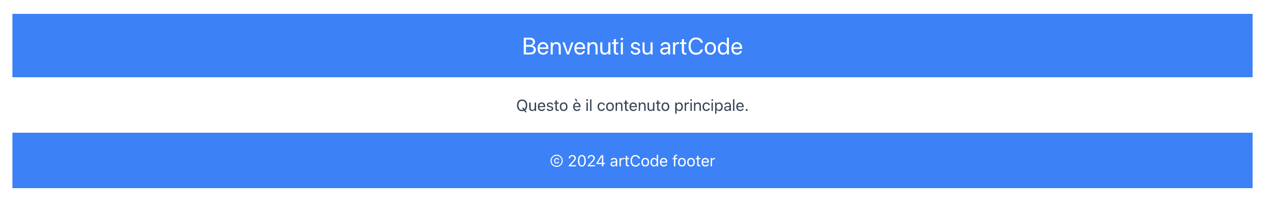
Layout example
const Layout = () => {
  return (
    <div className="container mx-auto p-4">
      <header className="bg-blue-500 text-white p-4">
        <h1 className="text-2xl">Benvenuti su artCode</h1>
      </header>
      <main className="mt-4">
        <p className="text-gray-700">Questo è il contenuto principale.</p>
      </main>
      <footer className="bg-blue-500 text-white p-4 mt-4">
        <p>© 2024 artCode footer</p>
      </footer>
    </div>
  );
};
Three-column grid example
const Grid = () => {
  return (
    <div className="grid grid-cols-3 gap-4 p-4">
      <div className="bg-red-500 text-white p-4">Colonna 1</div>
      <div className="bg-green-500 text-white p-4">Colonna 2</div>
      <div className="bg-blue-500 text-white p-4">Colonna 3</div>
    </div>
  );
};
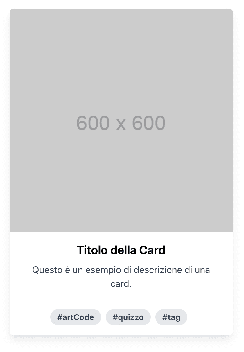
Card component example
const Card = () => {
  return (
    <div className="max-w-sm rounded overflow-hidden shadow-lg m-4">
      <img
        className="w-full"
        src="https://via.placeholder.com/600"
        alt="Placeholder"
      />
      <div className="px-6 py-4">
        <div className="font-bold text-xl mb-2">Titolo della Card</div>
        <p className="text-gray-700 text-base">
          Questo è un esempio di descrizione di una card.
        </p>
      </div>
      <div className="px-6 pt-4 pb-2">
        <span className="inline-block bg-gray-200 rounded-full px-3 py-1 text-sm font-semibold text-gray-700 mr-2 mb-2">
          #artCode
        </span>
        <span className="inline-block bg-gray-200 rounded-full px-3 py-1 text-sm font-semibold text-gray-700 mr-2 mb-2">
          #quizzo
        </span>
        <span className="inline-block bg-gray-200 rounded-full px-3 py-1 text-sm font-semibold text-gray-700 mr-2 mb-2">
          #tag
        </span>
      </div>
    </div>
  );
};
Example of possible text headers
const TextHeaders = () => {
  return (
    <div className="p-4">
      <h1 className="text-4xl font-bold mb-4">Titolo H1</h1>
      <h2 className="text-3xl font-semibold mb-4">Titolo H2</h2>
      <h3 className="text-2xl font-medium mb-4">Titolo H3</h3>
      <p className="text-lg text-gray-700">Questo è un paragrafo di esempio.</p>
    </div>
  );
};
As shown in the examples, Tailwind CSS offers a wide range of utility classes that simplify the creation of React layouts and components.
The utility-first concept of Tailwind CSS represents a significant change from traditional CSS development approaches. This method allows developers to be more productive and maintain clean and modular code, thus improving the overall frontend development experience.
Try experimenting with the different utility classes to see how much they can improve your development workflow!