Is there a quick and easy method to generate a dialog window (commonly known as a pop-up)?
Absolutely yes! Starting from March 2022, a new HTML element was officially introduced that allows creating this type of component in an easy and immediate way. It's the dialog element.
In this article we'll explore the use of this element and some of its associated CSS properties, simplifying a development that until recently was more laborious.
The structure
<p>Lorem ipsum dolor sit amet, consectetur adipiscing elit, sed do eiusmod tempor incididunt ut labore et dolore magna aliqua.</p>
<button class="open">Apri popup</button>

<dialog id="popup">
    <button class="close">Chiudi</button>
    <h2>Lorem ipsum dolor</h2>
    <p>Sed ut perspiciatis unde omnis iste natus error sit voluptatem accusantium doloremque laudantium, totam rem aperiam.</p>
</dialog>In this case we generated a dialog element, which inside has a button (which we'll use to close the dialog window), a title and a paragraph.
The first thing we can notice is that inserting this element inside an HTML page, it will be hidden; that is, not visible. This behavior is correct, because the dialog window appears only in case of an interaction (for example on clicking a button).
So let's add a few lines of JavaScript to make opening and closing the element possible:
const popup = document.querySelector("#popup");
const openPopup = document.querySelector(".open");
const closePopup = document.querySelector(".close");

openPopup.addEventListener("click", () => {
    popup.showModal();
});

closePopup.addEventListener("click", () => {
    popup.close();
});These JavaScript functions allow us, through the button class="open" and button class="close", to open and close our dialog window simply by clicking on the buttons provided in the example.
NOTE: a built-in feature is the ability to close the popup using the keyboard: by pressing the ESC key, in fact, the window will disappear.
Let's add some CSS style
If we try to insert this structure inside a page, we'll notice that the dialog window has some default style. We can also notice that when opening the popup, an opaque background is applied to the page, to highlight the opening window; in the next section of the article we'll discover a new pseudo-class to easily manage this functionality that is provided to us.
In the meantime let's try to give a more appealing look to our popup, adding some CSS style:
dialog#popup {
box-sizing: border-box;
position: relative;
width: 500px;
max-width: 90%;
padding: 2rem;
border: none;
border-radius: 1rem;
font-family: Calibri, sans-serif;
color: #ffffff;
background-color: #616161;
box-shadow: 0 0 1rem #616161;
button.close {
position: absolute;
inset: 0 0 auto auto;
width: 2.7rem;
aspect-ratio: 1/1;
font-size: 1.3rem;
line-height: 100%;
color: currentColor;
border-bottom-left-radius: 1rem;
border: none;
background-color: #000000;
cursor: pointer;
}
}The result will therefore be:
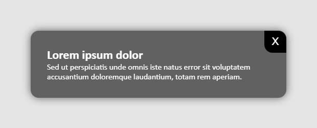
Pseudo-class ::backdrop
How do we manage the popup background? The answer is ::backdrop!
This magnificent pseudo-class allows us to manage our popup background without having to add additional elements in HTML. In this way we can therefore customize the background color according to our needs:
dialog#popup {
/* style popup */
&::backdrop {
background-color: #00000060;
}
}In this case, using backdrop, I attributed a black background color with 60% opacity.
The complete example
Here's the complete example seen previously:
<div class="container">
<p>Lorem ipsum dolor sit amet, consectetur adipiscing elit, sed do eiusmod tempor incididunt ut labore et dolore magna aliqua.</p>
<button class="open">Apri popup</button>
<dialog id="popup">
<button class="close">X</button>
<h2>Lorem ipsum dolor</h2>
<p>Sed ut perspiciatis unde omnis iste natus error sit voluptatem accusantium doloremque laudantium, totam rem aperiam.</p>
</dialog>
</div>
<style>
*:not(dialog) {
margin: 0;
padding: 0;
}
.container {
max-width: 1200px;
margin-inline: auto;
font-family: Calibri, sans-serif;
}
/* Style */
dialog#popup {
box-sizing: border-box;
position: relative;
width: 500px;
max-width: 90%;
padding: 2rem;
border: none;
border-radius: 1rem;
font-family: Calibri, sans-serif;
color: #ffffff;
background-color: #616161;
box-shadow: 0 0 1rem #616161;
button.close {
position: absolute;
inset: 0 0 auto auto;
width: 2.7rem;
aspect-ratio: 1/1;
font-size: 1.3rem;
line-height: 100%;
color: currentColor;
border-bottom-left-radius: 1rem;
border: none;
background-color: #000000;
cursor: pointer;
}
&::backdrop{
background-color: #00000060;
}
}
</style>
<script>
const popup = document.querySelector("#popup");
const openPopup = document.querySelector(".open");
const closePopup = document.querySelector(".close");

openPopup.addEventListener("click", () => {
    popup.showModal();
});

closePopup.addEventListener("click", () => {
    popup.close();
});
</script>Opening and closing popup. Can it be customized?
How does the show/hide of the popup work? Let's find out!
The show/hide of this dialog window is managed by default through the display: none/block property. The moment we activate our popup (that is, open it), inside the dialog tag the open attribute is added, to which the display: block property is attributed.
Closed dialog window:
<dialog id="popup">
    ...
</dialog>Open dialog window:
<dialog id="popup" open>
    ...
</dialog>Nothing prevents us from customizing this management by overwriting the default browser styles with, for example, a custom animation through the use of a @keyframes or a transition using the opacity property.
A mention to forms
Another feature to keep in mind is precisely the use of the attribute: method="dialog"!
This attribute inserted inside the form tag allows automatically closing the dialog window once the form is successfully submitted.
So let's try adding a simple form inside our popup, and performing a submit:
<dialog id="popup">
    <button class="close">X</button>
    <h2>Lorem ipsum dolor</h2>
    <p>Sed ut perspiciatis unde omnis iste natus error sit voluptatem accusantium doloremque laudantium, totam rem aperiam.</p>

    <form method="dialog">
        <input type="text" placeholder="Nome">
        <input type="email" placeholder="Email">
        <button type="submit">Iscriviti alla newsletter</button>
    </form>
</dialog>This can be very useful when the popup's only purpose is to submit a form (such as for example a newsletter subscription).